A detailed guide to transforming you into a more successful trader. Find out how to use trade charts in day trading to determine when to enter or exit a trade.
Introduction
Cryptocurrency is undoubtedly a significant innovation for mankind. People can look at money in a new light and invest in this new technology. However, we can’t deny that there is a lot to keep track of with crypto especially if you are putting large sums of money into it.
Many people have lost money trying to invest in cryptocurrency and in most cases, it could have been avoided. Day trading charts are the new age of Wall Street. This is where you keep track of the fluctuations in the value of your digital currency and know when to invest and sell.
In this article, we will take a closer look at three kinds of charts that are especially useful for trading. These include the line chart, Bar chart, and candlestick chart. In addition to that, we will delve deeper into the different facets of chats that you need to understand to improve your predictions.
Table of contents
Charts
An Intraday chart displays price fluctuations over a particular day. To better understand what intraday charts are, you need to grasp the concept of stock pattern analysis. The x-axis or horizontal axis shows the time on the trading chart, while the y axis or the vertical axis indicates the price.
The price movements from the left to the right of the horizontal axis are beneficial in analyzing shares. They help technical and financial analysts evaluate and predict future price fluctuations in exchanges. An exchange is a marketplace where financial instruments, such as securities are traded. Let us find out more about day trading charts and skills of chart pattern analysis.
Best Charts for Day Trading
Technical charts for stock are a crucial tool used by financial analysts seeking profits from price movements. A stock chart technical analysis usually focuses on price action for specific security for a particular time frame or a single day. There are various day trading charts used globally, like bars, candlesticks, and others. Every share market chart has its pros and cons.
You will find a variety of technical stock charts in forex exchanges like the New York Stock Exchange (NYSE), Bombay Stock Exchange (BSE), National Stock Exchange of India (NSE), Tokyo Stock Exchange (TSE), and many others. They have live charts to help you view price movements in real-time. For companies to be listed in the NYSE, they should have at least $4 million equity. You have to find the chart that best suits your skills, needs, and trading patterns.
Companies use forex digital marketing services to set themselves apart in the industry. Besides, it allows brands to establish themselves as legitimate and honest firms. On top of that, it helps businesses to attract relevant attention, achieve efficiency, convert more leads and target the right market. Ultimately, it will enable a company to combat unregulated competitors.
Some countries have a market index consisting of the most established companies like the Nifty and Sensex. Also known as Nifty 50, the Indian market index is made up of the 50 top and well-established companies. This market index allows traders to measure the overall performance of stock markets. These market indices are a good technical indicator of market performance because it works across different sectors.
Line graph
A line graph is a stock chart showing price changes within a specific time using a continuous line. There are several data points on the price graph known as markers/nodes connected by straight lines. As mentioned earlier, this graph has a y-axis and an x-axis. The x-axis shows the time values, while the y axis shows the quantitative values.
Bar & Candlestick Charts
Candlesticks and bar charts look different, but they provide similar information. On top of that, they are the most commonly used technical chart types. A chart is a diagram showing historical price moves over a specific time. For example, each candlestick or bar has a closing, opening, low, and high price in a particular time frame.
Bar Chart
A bar chart is a type of stock graph with multiple rectangular bars. This chart compares different values and can be plotted horizontally or vertically. However, the vertical format is the most common. Each bar has a vertical line indicating the highest and lowest price within a specific time frame. Note that the opening price is shown by a small horizontal line on the left of the bar or vertical line. A small horizontal line indicates the closing price on the right side of the vertical line.
If the closing price is at a higher level than its opening price, that bar is colored green or black. In contrast, when the closing price is lower, the bar is colored red because the price dropped within that time period. Thus, color coding helps you and other traders to see the price changes and stock trends more clearly. Besides, color-coding exists as an option in various charting platforms.
Tick Chart
Unlike most charts that create a new bar according to a specific time interval, tick charts make a new bar when a particular or pre-determined number of transactions are complete. Many financial analysts and traders find the tick chart quite effective because each bar equals a certain number of transactions. This method could be effective in reducing market noise. For instance, each bar of a 2000 tick chart shows 2000 transactions of any size. This diagram can be essential when making out what happens during the market session.
Candlestick chart
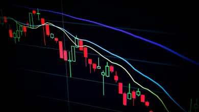
Candlestick charts tend to be more visual to highlight the differences between closing and opening prices. This trade graph originated from Japanese traders and rice merchants. Furthermore, a red color code indicates that the closing price is lower than the opening price. On the other hand, a green color shows that the opening price is higher than the closing price. That means candlesticks might be the best chart for intraday trading.
Heikin Ashi
Heikin Ashi is a charting method used to display prices that looks like the candlestick chart. While the candlestick helps you identify attractive entry points, the Heikin Ashi trade graph helps determine whether you should get out or get in a particular trade. This trading graph acts like a modified candlestick chart and rearranges the historical process to allow traders to decide when to remain in a business or get out. Heikin Ashi is ideal for newbies and experienced traders.
Renko
Renko charts are a trading diagram that helps isolate and filter out all small price trends for traders to focus on more significant price changes. Unlike most trade charts that use standardized time intervals and price, Renko is built using price movements. The chart resembles a series of bricks. Each brick is made when there are significant price movements. Also, each brick is found at a 45-degree angle to the previous brick. A down brick is given a red or back code, while an up brick is colored green or white.
Kagi
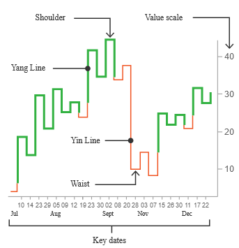
This chart utilizes a series of vertical lines to show various demand and supply levels for certain assets. These technical analysis charts were created in Japan to indicate the intraday chart patterns of some agricultural products, especially rice. Thin lines indicate an increased supply and lower prices if it falls below the previous low. On the other hand, thick lines usually stipulate increased demand in addition to higher costs beyond the marked price. Furthermore, a horizontal line represents a price reversal, while a vertical line indicates the high and low of a specific asset.
SharpChart
A SharpChart is a technical diagram showing price values for a data set or ticker symbol over a specific time frame. This chart has various settings to help you customize your graph with essential technical indicators like overlays. Some of the main features of a SharpChart include a price plot area, main ticker symbol, primary vertical axis, and others.
Other than SharpChart, there are other complementary financial charting tools like the advanced charting platform (ACP). The ACP is designed to offer an interactive and detailed charting platform with various feature sets compared to other charting tools. For example, one of the best financial charting tools is StockChartACP. In addition, charting tools can give you exclusive access to various features and US equities.
Additionally, you can use PerfCharts for technical chart analysis. PerfCharts help you to scrutinize various ticker symbols over a time frame. Since a PerfChart allows you to compare multiple performance lines, you can reach more than two ticker symbols. These analyses might help you make a more accurate investment plan.
Timing Set up
Regardless of which market you select, each second or time frame is an excellent opportunity for a trade. Each time frame, often found on the X-axis, gives you the trading information. For example, you can find 30-minute, 1 minute, or 15-minute charts. Although most charts are time-based, some may focus on price movements and volume. For example, a 10-minute chart is a type of time-based frame.
The time you spend on your screen determines the ideal time frame. For example, if you are spending several hours online, you should use a higher time frame. However, if you plan to be online for a few minutes, a short term is best suited for you. Since each trade has multiple possibilities, you should only open deals with good profit potential and align with your trade plan. Furthermore, you should know the different types of chart patterns.
Understanding day trading charts
Day trading involves buying and selling certain financial instruments within the day. You might know the nitty-gritty about chart reading and pattern trading. However, you must have a well-thought-out strategy to decipher technical chart patterns. Let us look at some technical indicators to get you started.
Technical indicators
Multiple technical indicators help traders analyze and understand market needs and the demand and supply stock patterns. Identifying the right indicators may help you make a solid foundation for your financial investments and future charts. However, finding how each chart works and the right sign that suits your trading pattern might be challenging. That’s why we have evaluated the most popular technical indicators to get you started:
Volume indicator
Trading volume involves measuring how many financial assets were traded in a particular time frame. Volume is often a strong indication of market strength because rising markets often have larger trade volumes. In contrast, when prices decline on increasing volume, the market’s gathering strength may be on the decline. Also, it might indicate reversal patterns when asset prices experience no lows or new highs on decreasing volume.
Simple Moving Average (SMA)
Moving averages is an essential factor in technical indicators showing the average price over a specific time frame. SMAs are critical in determining stock trend direction and trigger trade signals. The figure is calculated by adding recent prices and then dividing the total number of time frames. The SMA formula is:

Where
n is the number of time frames or total periods
An Is the asset price at a specific period n.
Average True Range (ATR)
Average True Range is a value that helps analyze market volatility by evaluating the entire asset price range in a particular time frame. The ATR is usually calculated from the 14 days SMA of a succession of true range indicators. Although it was initially used in commodities, it is now applied to various securities. When calculating the ATR, you must have a series of true range values. Then, you calculate the price range by subtracting the low from the high. The ATR formula is:

Where
n = time
TRi = a specific true range
Oscillators
An oscillator describes a momentum indicator that shows the movement of data between an upper and lower band. When the data approaches these bands, they give you or other traders oversold or overbought signals. Oscillators are essential in determining a clear trend in stock prices. Traders often use oscillators with moving average indicators to show trend reversal patterns or breakouts.
Chart patterns
There are various trading opportunities in charts, but you have to identify the best patterns and times to enter or exit a trade. Finding the right option without adequate skills may be similar to looking for a needle in a haystack. Stock chart patterns are vital in chart pattern analysis to help predict movement and analyze market trends. There are two main chart patterns: Bullish chart patterns and bearish chart patterns. Bullish patterns mean that traders are willing to enter the market, and the stock prices are increasing. In contrast, a bearish pattern suggests that traders are willing to sell risky assets.
If you have the appropriate skills and knowledge to read chart patterns and utilize price action patterns, you can boost their odds of making predictions. Note that interpreting chart patterns requires patience, dedication, and practice. There are three main chart patterns: reversal, continuation, and bilateral. Let us cast a closer look at them.
- Reversal chart patterns: These chart patterns suggest that the ongoing trend may change and the price may decrease. Some of the trend reversal patterns include a falling wedge, double top, rising wedge, and double bottom.
- Continuation chart patterns: These chart formations suggest that the ongoing trend might resume or continue. Some of the continuation signals include pennants, rectangles, and wedges.
- Bilateral chart patterns: These are a bit complicated because price patterns can go either way. Some of the patterns include symmetrical triangles, descending triangles, and ascending triangles.
Software
There are varieties of software to help you analyze financial products like currencies or stocks. Take the time to learn how to use the software strategically and understand how to study charts. Some of the standard features of high-quality trading software include fundamental chart analysis, order placement, paper trading, automated trading, and technical analysis chart patterns. Besides, software improvements help users to access a variety of data points.
Some of the software options include Meta Trader, Linux software, TradingView, and many others. Most software developers offer potential clients a free trial period before committing to buy. Take this opportunity to try out various tech options. Get to find out the features and tools you like and would enjoy using. In addition to that, analyze the broker’s pros and cons, such as commissions. Some of the top brokers include AMP Global, CMC Markets, and London Capital Group (LCG).
Free charts
Stock patterns are an essential tool for traders. However, there is something more critical than charts – free stock charts. Charts are crucial in understanding how to read graphs for trading. Recognizing chart patterns might give you a competitive advantage. Take time to familiarize yourself with sites to get free charts like FINVIZ, TradingView, Google Finance, TD Ameritrade, and many others. You can get candlestick charts free of charge on these sites.
In most situations, you should focus on stock graphs that many traders are buying and avoid stocks that most people are selling. The free stock charts show you the price trends and how investors are trading. The price movements can help you find out when to hold, sell, or buy. Intraday charts give you a real story of the stock market. In addition to that, these sites can help you get free candlestick charts for Indian stocks and many others.
Key points
Although most people find stock technical charts quite tricky, they are simple to read after adequate training. They are simply a visual representation of important market trends like trading volume, share charts, and share price. Moreover, charts usually give you an objective picture of the trends. We have highlighted some of the primary signs to look for when studying chart patterns for day trading. Some of the tricks include sell signals, buy points, and base patterns. This guide can be used in many financial markets for you to generate a substantial profit.

